What makes a club? Culture, history… championships? All of the above, but what about their visual standpoints? Logos and symbols are a show of the product and identity of a club and what they stand for… first impressions always count, and rarely do you get a second one.
Many uneducated sports people are drawn to a particular club based on how the logo and uniform design agrees with their eyes, so let’s delve into the logo designs of all nine NBL clubs, ranking them from worst to best.
The worst logo in the NBL is…

#9 New Zealand Breakers
Bang average, the Breakers boast a logo that looks as if it would take ten minutes to construct on Microsoft Powerpoint. It is dull, boring and the only source of colour is the basketball. This is a club that is in desperate need of a design makeover. This one is the opposite of eye-catching and if it weren’t for the basketball, it actually could pass as an advertisement for the country of New Zealand itself more-so than a sporting club.
#8: Melbourne United
Until they were rebranded, the Melbourne Tigers boasted one of the great logos, the classic tiger cuddling the ball was cute, yet intimidating with the famous red and yellow strip fondly remembered with Andrew Gaze back in the day. Although the rebranding has done them well, and the black and white colours do look good… the big ‘M’ logo is plain, boring and if it weren’t for the tiny basketball at the top, you would have no idea it was even a sporting club. They may be one of the best teams in the competition, but their logo is very average.

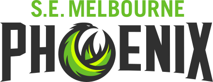
#7: South East Melbourne Phoenix
The colours look cool, the writing is big and bold and overall it isn’t, bad design by any means. However, the weird crossed Phoenix barely looks like a phoenix at all. It may be trying to resemble a basketball, but it just looks like a scribbled green circle gone wrong! Take A-League club Wellington Phoenix and you’ll see what a Phoenix really is, that is one of the best logos for any sporting club in Australia… but this one needs work.

#6: Adelaide 36ers
Again, not a terrible logo… but doesn’t actually give any indication of what it is. The magpie staring down looks cool, but where are the famous South Australian colours of red, yellow/gold and navy blue? The best logo the Sixers had was the big 36 with the ball and arrow from the 90’s. This one is modern, which for classic logo/uniform fans isn’t a good thing necessarily.

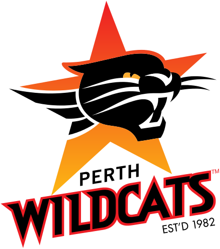
#5: Perth Wildcats
Great logo, the writing looks elegant and intimidating. The ‘Est’d 1982’ is a fantastic initiative to subconsciously honor their humble beginnings and history. When you qualify for thirty three consecutive finals series, it is understandable they haven’t changed their logo for years.

#4: Cairns Taipans
A solid logo! The big snake wrapped around the TAIPANS looks crisp and clean, with the basketball sitting at the bottom, it is elegant and attractive to the eye. The only complaint is the writing font, which could do with a touch up and possibly have a more sophisticated yet rough font, similar to the Perth Wildcats. Regardless, this logo is certainly one of the better ones of the competition.

#3: Brisbane Bullets
Slightly contradictory with Melbourne United early, but sometimes less is more, in this situation it is true for the Queenslanders. Their simple yellow and blue design with the basketball whizzing past the writing is clean, sophisticated and looks good on a polo or shirt design. There is no need for an animal or actual mascot plastered on this logo, it already looks great because of its easy-on-the-eyes look.
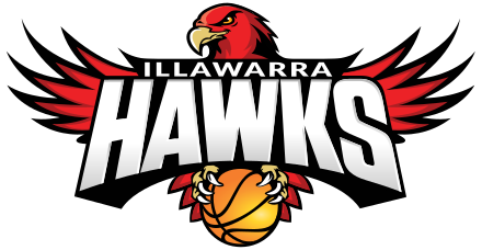
#2: Illawarra Hawks
The most intimidating logo in the competition. The massive hawk imposing itself behind the writing, it’s long claws cradling the basketball tightly looks great. The font is the perfect size and proportion for this design and colours of red, orange and white all go well together.
#1: Sydney Kings
One of the great basketball logos in any league, after all these years it still stands up. A cool, elegant and just a truly sentimental basketball logo. The retro, old school styled font, crown and basketball all work well together with the swish and class of the famous yellow and purple. This is one logo that will likely never be changed or altered. The best logo in the NBL by a big, big stretch.


